Introducing the Concept of Color Theory and “What’s the Opposite of Pink”
Every color has its own unique character, and the way colours interact can greatly influence the aesthetics and emotions of a design. In this article, we’ll delve into the intriguing world of color theory and explore a specific question that often arises in design and art: “What’s the opposite of pink?”Color theory is the foundation upon which all visual design is built. It’s the art and science of using color to create appealing visual elements.
Whether you’re a graphic designer, a painter, an interior decorator, or just someone looking to add a pop of color to your life, understanding color theory can be a game-changer.
What’s the Opposite of Pink?
The phrase “opposite of pink” isn’t merely a whimsical inquiry; it’s a fundamental concept in color theory.
n this context, “opposite” refers to the complementary color of pink. Complementary colours are pairs of colours that, when combined, cancel each other out, creating a neutral or greyish tone. When placed next to each other, complementary colors create a striking visual contrast that can be visually appealing.To find the opposite of pink, we need to turn to the color wheel. The color wheel is a visual representation of how colors relate to one another. It’s divided into various segments, each representing a different color. Pink, in this case, falls within the red segment of the color wheel.
Understanding the Color Wheel:
When it comes to understanding the world of colours and finding the answer the color wheel is our trusty guide. The color wheel is a fundamental tool in color theory that helps us grasp how colors relate to each other. By examining this wheel, we can determine the complementary color, or the opposite, of any given hue. In our case, we’re on a mission to unveil the opposite of pink.
The Basics of the Color Wheel
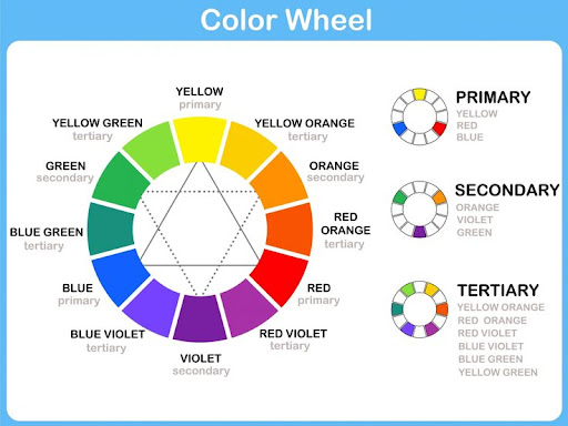
The color wheel is a visual representation of the spectrum of colours. It organises colours in a circular format, making it easier to see their relationships. The standard color wheel consists of 12 colours, but it can be extended to include more shades for more intricate color analyses.
How Colours Are Organised on the Color Wheel
The colours on the wheel are typically arranged in the following order:
- Primary Colors: Red, blue, and yellow are the foundational colors. They cannot be created by mixing other colors.
- Secondary Colors: These are created by mixing equal parts of two primary colors. For instance, red and blue combine to form purple, blue and yellow create green, and red and yellow produce orange.
- Tertiary Colors: These are the result of mixing a primary color with a neighboring secondary color. Examples include red-orange, yellow-green, and blue-purple.
Significance of Color Relationships in Design
Colours don’t exist in isolation; they interact with each other in various ways. The color wheel is invaluable in design, art, and even in our everyday choices, such as fashion and interior decor.
It helps us create harmonious color schemes, capture attention, and convey different moods and emotions.To find the opposite of pink, we’ll be exploring the concept of complementary colours. These are pairs of colours that are positioned directly opposite each other on the color wheel. Complementary colors have the highest contrast and, when used together, can create striking and visually appealing combinations.
The Meaning of Pink
When exploring the world of colours, it’s essential to understand the significance of each shade. In this part, we’ll delve into the captivating world of pink and its emotional impact.
What is Pink?
Pink is a color that often evokes feelings of tenderness, love, and sweetness. It’s a color associated with warmth and comfort. The lightness and subtlety of pink can make it feel gentle and approachable. In some cases, pink is also linked to femininity and sensitivity.
Emotions and Associations with Pink
Pink is known to convey various emotions and associations:
- Love and Romance: Pink is often associated with love, passion, and romance. It’s a common choice for romantic gifts and occasions like Valentine’s Day.
- Youthfulness: The vibrancy of pink is often connected to youthful energy and exuberance. It’s a color that can make people feel playful and lively.
- Compassion: Pink is often linked to qualities like kindness, empathy, and understanding. It’s a color that can soothe and reassure.
- Femininity: In many cultures, pink is traditionally associated with femininity and is used in products and branding targeted towards women.
- Sweetness and Innocence: Pink is often seen as a symbol of innocence and sweetness, making it a popular choice for children’s products and themes.
Common Uses of Pink
The versatility of pink means it’s used in a wide range of applications:
- Fashion: Pink clothing and accessories are popular choices, especially in women’s fashion.
- Interior Design: Pink can be used in interior decor to create a calming and cozy atmosphere.
- Branding: Many brands use pink to convey emotions like love, compassion, and youthfulness.
- Healthcare: In healthcare, pink is sometimes used to create a soothing and comforting environment.
What Does “Opposite” Mean in Color Theory?
In the realm of color theory, the concept of opposites plays a crucial role.We are delving into the fundamentals of how colours interact and complement each other. Understanding this notion is essential for creating visually appealing designs and harmonious color schemes.
Complementary Colours and the Color Wheel
In color theory, “opposite” typically refers to complementary colors. Complementary colors are pairs of colors that are positioned directly across from each other on the color wheel. These pairs are considered opposites because they create the most contrast when placed side by side. This contrast can be visually striking and is often used to draw attention or create a dynamic, balanced composition.
The Importance of Complementary Colours
Complementary colours have several important roles in design and color theory:
- Creating Visual Interest: When complementary colors are used together, they create a vibrant and eye-catching effect. This can be especially useful in advertising, web design, and branding.
- Balancing Color Schemes: By incorporating a color’s complement, designers can balance and neutralize a color palette. For instance, if you have a predominantly pink design, adding its complement can prevent it from becoming overwhelming.
- Enhancing Readability: In graphic design and typography, complementary colors can be used to improve readability. Text in a complementary color to the background can stand out and be more legible.
Identifying the Complement of Pink
To find the complement of pink, we need to refer to the color wheel. Pink, being a shade of red, falls into the warm color category. Its complement will be a color that is diametrically opposite to it on the color wheel. In this case, the opposite of pink is green.
So, What’s the Opposite of Pink? It’s Green!
Understanding that green is the opposite of pink can guide your design choices. These two colours, when used together, can create a harmonious and visually appealing contrast. This knowledge is valuable when you want to make certain design elements pop, evoke specific emotions, or maintain a balanced composition.
Applications of Pink and Its Opposite in Design
When it comes to design, understanding the concept of complementary colors is essential for creating visually appealing and harmonious compositions.
In this section, we’ll explore the practical applications of pink and its opposite on the color wheel.
Using the Opposite of Pink
In design, the opposite of pink on the color wheel is green. This complementary color pairing offers a striking contrast that can be used to capture attention and create a sense of balance. Let’s delve into some ways these colours are applied:
1. Visual Impact in Branding
“What’s the opposite of pink?” This question is often asked by brand designers seeking a distinctive and memorable look. By combining pink with its opposite, green, brands can achieve a unique visual identity.
The pink-green contrast not only grabs the audience’s attention but also conveys a sense of harmony. Consider the iconic T-Mobile logo, which uses a magenta pink alongside a vibrant green. This combination stands out in the telecommunications industry.
2. Interior Design and Home Decor
In interior design, pink and green provide a versatile palette for creating inviting and stylish spaces.By understanding the relationship between these two colours, you can achieve a balanced and refreshing look.For instance, a predominantly pink room can be complemented with green accents through furniture, plants, or decor items. This pairing creates an atmosphere that is both lively and calming, making it suitable for various room styles.
3. Fashion and Apparel
Fashion designers frequently play with color combinations to make statements and evoke emotions. The use of pink and its opposite in clothing can result in striking and trendy outfits. A pink dress paired with green accessories, for example, offers a fashionable and bold look. Fashion brands like Lilly Pulitzer have built their entire brand identity around the pink-green color scheme, reflecting a sense of fun and luxury.
4. Web and Graphic Design
In digital design, understanding the opposite of pink is crucial for creating eye-catching websites and graphics. Combining pink and green in web design can lead to visually appealing and user-friendly interfaces. The complementary colours can be used for call-to-action buttons, highlights, and contrast to improve the overall user experience.
Choosing the Right Color Combinations:
When it comes to designing with colors, understanding the concept of complementary colors is essential. In this section, we’ll explore how to select the right color combinations and specifically focus on what’s the opposite of pink. By incorporating this knowledge into your design projects, you can create visually stunning and harmonious compositions that catch the eye.
Why Complementary Colors Matter
In the realm of color theory, complementary colours are pairs of colors that sit directly opposite each other on the color wheel. This relationship creates a striking visual impact when used together. The complementary color to pink is green, making it the direct opposite on the color wheel.
Using the Opposite of Pink: Green
Green is a versatile color, and when used in combination with pink, it can create a visually pleasing contrast. This combination is not only aesthetically appealing but also psychologically powerful. The vibrancy of pink and the calming nature of green can work together to convey a sense of balance and harmony in your designs.
Tips for Effective Color Combinations
- Balancing Act: When using the opposite of pink (green), maintain a balance between the two colors. You can experiment with different proportions to achieve the desired effect. For instance, in a predominantly pink design, a touch of green can make elements pop.
- Context Matters: Consider the context of your design. The message you want to convey and the emotions you aim to evoke play a vital role in determining the right color combination.
- Test and Refine: Don’t be afraid to test various color combinations. Tools like color wheels and online color palette generators can help you find the perfect match for your project.
- Audience Consideration: Think about your target audience. Different colors can have various cultural and psychological associations, so choose colors that resonate with your specific audience.
- Consistency: Maintain color consistency throughout your design. This ensures a cohesive and professional look.
Tools and Resources for Color Selection
To make the process of choosing the right color combinations easier, there are several tools and resources available. Some popular ones include:
Adobe Color Wheel: An interactive color wheel tool that helps you explore different color harmonies.
Coolors: An online color palette generator that provides endless color scheme possibilities.
Color Psychology Resources: Books and articles on color psychology can help you understand the emotions and meanings associated with specific colors.Incorporating the knowledge into your design projects can elevate the visual appeal and effectiveness of your work. Whether you’re designing a logo, a website, or any other creative project, the right color combinations can make a significant difference.
Conclusion:
In the world of design and creativity, color is a powerful tool that can evoke emotions, convey messages, and captivate audiences. Understanding the concept of complementary colors, especially knowing what’s the opposite of pink, can be a game-changer in your design endeavours. This complementary relationship between pink and green offers a wide spectrum of possibilities for creating visually appealing and harmonious color combinations.
By applying the principles discussed in this article, you can enhance your design projects and make them more engaging and impactful.